Jon Schwartz notes:
New logo for US spy satellite from National Reconnaissance Office is weirdly similar to anti-communist propaganda:
From the Trenches World Report
Enforce our Bill of Rights
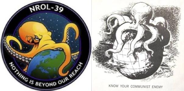
Jon Schwartz notes:
New logo for US spy satellite from National Reconnaissance Office is weirdly similar to anti-communist propaganda:
You have to love it when they make it obvious, don’t you?
thanks Diggerdan. i knew i had seen that somewhere before.
Similar my a$$, it looks the same, just updated.
My Fellow Patriots:
“Eerily Similar To American Depiction of Communists”
No,.. it is not “Eerily” similiar,… its identical to the communist logo because it IS the communist logo.
As I have stated in the broadcast,.. all that is left for these communists to do to let us know they have overthrown our country,.. is to hang a huge red banner across the capital building with the Soviet Sickle on each side of the phrase, “Under New Management By Communists”
What does it take people before we Americans say,.. “enough!”?
JD – US Marine – When it starts, remember,.. NO QUARTER!
One difference. The octopus is facing the other direction – from East to West.
An subtle (or not so subtle) indication that the new superpower is to be China?
Just a thought.